
The corporate identity either Visual identity (IVC) refers to the visual aspects of an organization's identity. This image is directly related to the attributes of the entity's history or trajectory, projects it carries out and corporate culture.
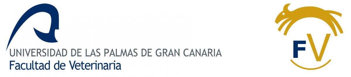
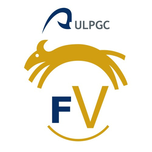
He logo of the Faculty of Veterinary Medicine of the ULPGC is the work of the designer Jacco van den Hoek and was presented in 2002. The author proposed four goals in developing the design:
- Reflect a young and dynamic organization that is also serious and solid. Youth and dynamism is captured in the animal jumping, circling around the world. The seriousness and solidity is reflected in the typography and color. The typography is greenish, feminine, with character and has mass/weight. And the color blue provides, psychologically, tranquility and security.
- Visually/literally reflect the veterinary/animal world. The author captures it in the extremities of the animal that together with the lower half arch form a circle, a world.
- Reflect internationality. The author tries to escape from the classic national symbols and get closer to the business and international world through a clear icon supported by solid and serious typography, although without forgetting the Latin joy (expressed through the jumping animal).
- Reflect an organization that is conscious of its environment. The author expresses this aspect through an ambiguous animal that symbolizes living beings in general and through the colors of the land and sea where they live. A basic logo with roots.
Below you will find the available formats, and within each downloaded file, you will find the different versions (color, monochrome, positive or negative).
On the right you will find a mini-manual so that you can properly use our logo and the symbol that allows you to join smaller spaces.
Please do not use adaptations or cuts of this logo, respect its design using the version that best suits the use you intend to give it.
Update – December 2018-
In order to adapt our logo to the General Regulations of the Logo (link) of the ULPGC, a modification of our logo symbol has been made.
The own symbol that is presented, at the request of the Faculty of Veterinary Medicine of the ULPGC, respects the essential elements of the initial design, optimizing it for the requirements of the University's Graphic Identity Manual (MIG).
The shape of the graphics has been slightly modified to include the concave arc of the original design, eliminated in the approved version of the ULPGC Graphic Identity Manual. Likewise, the central space where the logo is housed has been circulated. This change is almost imperceptible but makes it easier to reconstruct based on a geometric mesh.
The acronym of the name of the Faculty of Veterinary Medicine (FV) is used, retaining the Verdana bold font for the F and changing Helvetica medium to Helvetica. The width of the Ves is double the width of the F to underline the Veterinary term.
The position of the acronym (logo) at the bottom of the logo makes it easier to read the main graphics and allows for a larger font size.
The chromaticism combines the corporate blue of the ULPGC with the ocher yellow that remains the distinctive feature of the Faculty. Pantone 131 has been changed to 7555C to conform to current Adobe color books.